R Assignment 3
Introduction
There are several different approaches to making plots in R. These general approaches were introduced in the lecture and this assignment will be an opportunity to try them out.
Most of the below questions will ask you to make a certain plot given a dataset. You can see what these plots should like here.
Note that the final section also requires you to use a loop, which could be with lapply as shown in the lecture.
Base plots
Base plots are the simplest type of R plot. We’ll explore some straight-forward figures that can be made with this approach using the Puromycin dataset. Like most R objects you can see the help documentation with this command:
?Puromycin
First, we’ll make basic histograms to take a look at the overall distribution of the concentration and reaction rates in this dataset. Run this command to put two panels on the same base plot (note that you will need to set this back to 1,1 afterwards).
par(mfrow=c(1,2))
Q1: Plot histograms of concentration and reaction rates respectively as two panels in this plot. Remove the title, and set the x-axis label.
When making a histogram note that you can change the number of bins by changing the breaks option.
Q2: Next plot a scatterplot of the substrate concentrations against reaction rates. Add y and x-axis labels to this plot and fill in the points by setting the option pch=16.
Q3: Lastly, plot boxplots of the reaction rates for all treated and untreated samples separately. Clean up the labels and colours of this plot as above.
Note that comparing the two groups in this way is not ideal since the substrate concentration differs within each group. We’ll return to this in the lattice plots section below!
Before getting to that though it is helpful to know how you can combine different base plots. For instance, the beeswarm package is a helpful tool for visualizing data as indivudal points rather than as boxplots.
Run this command to install beeswarm:
install.packages("beeswarm")
And this command to load it:
library("beeswarm")
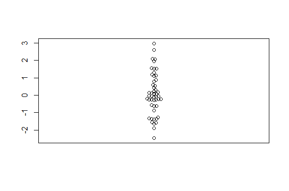
This example code would make this basic beeswarm plot:
beeswarm(rnorm(50))

In practice, you usually need to specify how to plot a beeswarm figure as a formula. You also could have made the above boxplot using this approach. The most basic usage is to specify that one column of a dataframe should be plotted against a different column.
For instance, given this dataframe:
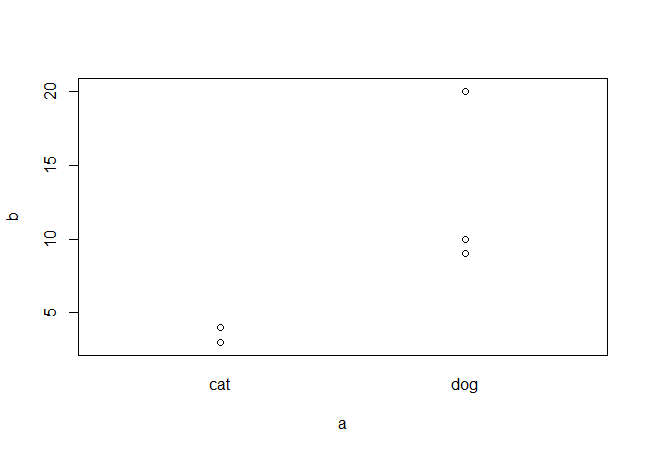
test_df <- data.frame(a=c("dog", "dog", "cat", "cat", "dog"), b=c(10, 20, 4, 3, 9))
test_df
beeswarm(b ~ a, data=test_df)

Q4: Make a beeswarm plot of reaction rate by state as for the boxplot above. Add this plot overtop of the boxplot by using the add=TRUE option in the beeswarm call. You will need to re-generate the boxplot first!
Lattice plots
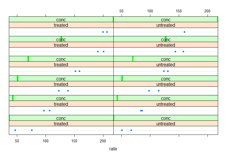
As described in the lecture, lattice plots are especially useful for plotting data against difference facets. For instance, the lattice dotplot function can be used to plot the reaction rates we plotted above for the Puromycin dataset while splitting the plots by both concentrations and state. To do this you will need to use a formula command with different syntax then above.
This is how you would generate the plot with lattice (note that you will need to run library(lattice) first):
dotplot(~rate | state + conc, data=Puromycin)

The npk dataset is another default dataset that comes with R. Take a look at this dataset with ?npk. We’ll make some lattice plots with this dataset to demonstrate the utility. Note that although these plots are useful for exploring the data I tend to prefer base and ggplot2 plots for publications; however, if you master the lattice options these plots can also be very flexible!
Q5: Plot lattice boxplots with bwplot of plant yield broken down by plant blocks.
Q6: Finally, make dotplots of the yield broken down by all combinations of blocks, N, and P treatments.
Intro to ggplot2
We’ll be using these two libraries in this section: reshape2 and ggplot2. Make sure these are installed and loaded in your environment.
We’ll be using a pre-made R object which you can download here. and read into R using the readRDS function. This object is a list of dataframe for 5 samples.
This is a small toy example dataset where each sample has arbitrary abundance values for both control and treated states.
Using lapply make a new list that contains the mean abundances of all control and treated values for each sample as a vector.
The new list should look like this (where X and Y are the mean control and treated abundances respectively):
$sample1
[1] X Y

$sample2
[1] X Y

$sample3
[1] X Y

$sample4
[1] X Y

$sample5
[1] X Y
Q7: What are the mean control and treated values for sample 4?
Once you have the above list convert it into a dataframe using the data.frame command:
mean_test_in_df <- data.frame(mean_test_in)
Now we’ll need to transpose the table using the t function. This function returns a matrix, so it needs to be converted back to a dataframe afterwards:
mean_test_in_df <- data.frame(t(mean_test_in_df))
Finally change the column names to be “control” and “treated” using the colnames function.
Your dataframe should look like this:
  control  treated
sample1 X Y
sample2 X Y
sample3 X Y
sample4 X Y
sample5 X Y
This format is very common in data analysis - the samples are the rows and the columns are features of interest. This format is often referred to as a “wide” format. ggplot2 is easiest to use when your data is in “long” format instead. You can convert from wide to long form by “melting” the table using the melt function from the reshape2 library.
Before doing this however you should add the sample names (which should be the rownames) as a new column called “samples”.
Now you can melt the table using this command:
mean_test_in_df_melt <- melt(mean_test_in_df, id="samples")
The first few rows of your table should look like this:
  samples variable    value
1  sample1  control X
2  sample2  control X
3  sample3  control X
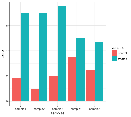
This command will plot a barplot of the data:
ggplot(mean_test_in_df_melt, aes(samples, value)) +
     geom_bar(stat = "identity", aes(fill = variable), position = "dodge") +
     theme_bw()

The ggplot term specifies which aesthetics to plot as the x and y components, the geom_bar term specifies that this should be a barchart and the fill (i.e. the filled colour) of the bars should be given by the “variable” column. stat and position are options specific to the geom_bar function and theme_bw() specifies that the background should be blank.
Q8: Plot a heatmap of this data using the geom_tile function with sample id on the x-axis and state on the y-axis. Note that you can specify colour ranges for a heatmap using this term (and blue as low and red as high in this case): scale_fill_gradient(low = "blue", high = "red").